
What is a brand guideline, and does a small business need one? The 6-page core
What is a brand guideline? In short, it is the rulebook that says how your logo, colours, typeface and tone of voice should be used. The printer, the person running your social media, the sign maker and whoever writes your website all work from the same book. A small business needs one too, not as a thick manual but as a 6-page core.
Most people do not know this: there is an international threshold that measures whether a text colour is readable. W3C’s accessibility standard, WCAG, asks for a contrast of at least 4.5 to 1 between normal text and its background. The golden yellow that looks lovely can fall far below that on a white background. A guideline is where you make decisions like this once, and correctly.
What exactly does a brand guideline do?
A brand guideline keeps your brand looking the same and speaking with the same voice everywhere. Even if the designer changes, the printer changes or your nephew runs the social account, the result stays consistent. In short, it is the one document that can carry your brand without you in the room. The brand in your head ends up on paper.
How it differs from corporate identity
Corporate identity is the set of visual parts: logo, colours, typeface. The guideline is the instruction sheet for how to use them. One is the ingredients, the other is the recipe.
An analogy
A guideline is like your mother’s handwritten pastry recipe book. Without it, everyone bakes the pastry their own way and every tray comes out different. With it, even the neighbour turns out the same pastry.
Does a small business really need one?
Yes, because more hands touch a small brand than you might think. The printer does the business cards, the sign maker does the shop front, a friend prepares the posts. When everyone pulls in a different direction, the customer sees the same business wearing three different faces. A guideline pulls that together in a few pages.
Say you run a hair salon
Say you are opening a hair salon in Beylikdüzü, Istanbul. The sign is navy, Instagram is pink and the business card is green. Customers do not recognise you, because a different business seems to greet them every time.
No thick manual needed
Big companies’ guidelines can run to dozens of pages. For a small business, the real job is to gather decisions in one place. The 6 pages below carry the essence of that job.
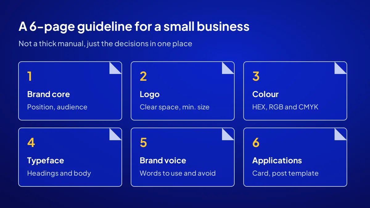
What goes on the first three of the 6 pages?
BU BÖLÜMÜN ÖZETİ
- 1. Brand core
- 2. Logo use
- 3. Colours
The first three pages cover the brand’s foundation and its two most-used visual parts: brand core, logo use and colours. If these three are written well, the rest of the guideline sits on them easily. Each page answers one question and stays short.
1. Brand core
The positioning sentence, the target audience and three adjectives for the brand, for example “warm, clear, reliable”. Every other page is measured against these three words.
2. Logo use
The logo’s versions for light and dark backgrounds, the clear space around it and its minimum size. Plus the don’ts: stretching it, changing its colour, placing it unreadably over a photo.
3. Colours
Each colour is written with three codes: HEX and RGB for screens, CMYK for print. Without codes, the printer says “roughly this”, and your navy turns purple.
Why choose colour by numbers, not by eye?
BU BÖLÜMÜN ÖZETİ
- Same colour, two results
- A near miss is still a miss
- What this has to do with sales
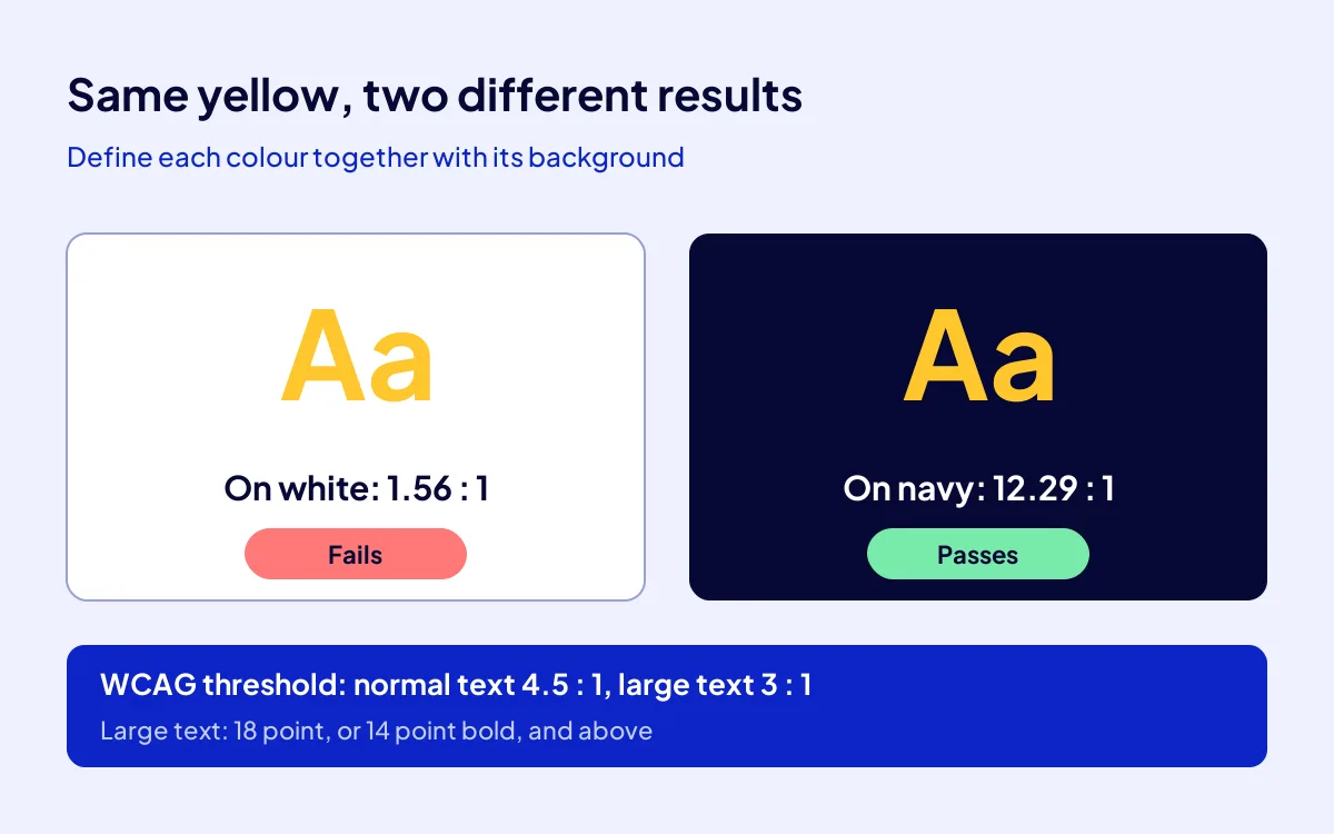
Because a colour that pleases the eye is not always readable. Under WCAG, normal-size text needs a contrast of at least 4.5 to 1 against its background, and large text at least 3 to 1. Large text means 18 point, or 14 point bold, and above. The guideline uses this ratio to state which colour can be used as text on which background.
| Text colour / background | Contrast ratio | For normal text |
|---|---|---|
| Dark navy (#070835) / white | 19.18 : 1 | Passes |
| Golden yellow (#FFC72C) / dark navy | 12.29 : 1 | Passes |
| Mid grey (#777777) / white | 4.48 : 1 | Fails by a hair |
| Golden yellow (#FFC72C) / white | 1.56 : 1 | Fails |
Same colour, two results
The golden yellow in the table reads easily on navy but almost vanishes on white. That is why a guideline defines a colour together with its background, never alone.
A near miss is still a miss
Mid grey, at 4.48, sits just under the threshold. The naked eye barely notices, but a customer on a phone, in the sun, without their glasses does. Free contrast checkers give you the ratio in seconds.
What this has to do with sales
An unreadable price, phone number or offer line is a lost customer. Contrast is not a matter of taste; it decides whether customers can read you at all.
How do the last three pages give the brand a voice?
BU BÖLÜMÜN ÖZETİ
- 4. Typeface
- 5. Brand voice
- 6. Applications
The last three pages cover the typeface, the brand voice and ready-made applications. If the first three say how the brand looks, these three say how it speaks and how it is used day to day. This is usually the part of the guideline people open most in practice.
4. Typeface
Which typeface to use for headings and body text, and in which weights. The typographic hierarchy, meaning how much larger a heading is than body text, is written here too.
5. Brand voice
Whether the brand speaks formally or casually, which words it likes and which it never uses. We cover how to put brand voice into words in our how to write brand voice guide.
6. Applications
Business card, social media post template, email signature and a sign example. Whoever opens the guideline copies the example instead of reading the rule. You can find the digital side step by step in how to make a digital business card.
Where does the guideline fit in the campaign?
BU BÖLÜMÜN ÖZETİ
- Identity first, then the guideline
- The 108 articles speak the same language
- Applying
- Now you know
In the Build Your Digital Brand campaign, the brand guideline is included in the package and is prepared once the identity is finalised. A social media kit and a digital business card come with it. The campaign is TRY 36,000 + VAT, fixed and paid upfront; there are 12 brand places, and the last day is 1 November 2026.
Identity first, then the guideline
Three directions are offered for the identity, and the chosen one is finalised. The guideline puts that final version in writing. We explain how the three directions are developed in three directions, one brand.
The 108 articles speak the same language
The package’s 108 articles are written in the brand voice set out in the guideline. That way the site, the business card and the posts all speak with one voice. You can see the whole package in how to build a digital brand.
Applying
To see what is in the package and how many places remain, go to the Build Your Digital Brand campaign page.
Now you know
A brand guideline is not a thick book but a six-page rulebook. It picks colours by ratio rather than by eye, never stretches the logo and puts the voice in writing. Even the smallest shop escapes the printer’s “roughly this” with one.
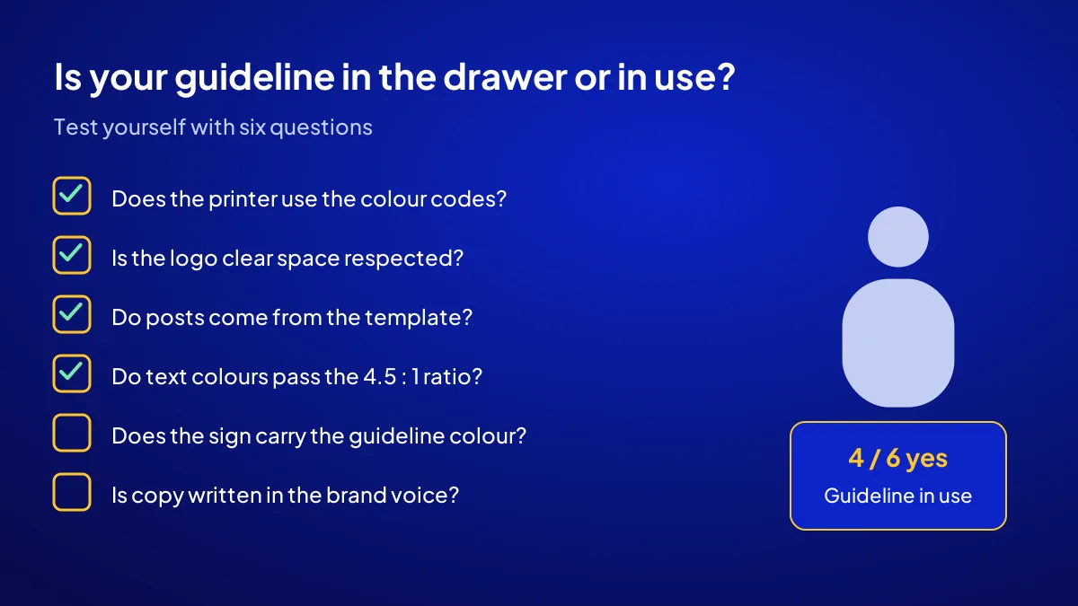
Quick Summary
- A brand guideline sets the rules for using the logo, colours, typeface and voice.
- For a small business, a 6-page core is a solid start.
- Colours are written with HEX, RGB and CMYK codes.
- Under WCAG, normal text needs a contrast of at least 4.5 to 1.
- The campaign includes the guideline, a social media kit and a digital business card.
- The guideline is prepared after the identity is finalised.
Short Glossary
Clear space: Clear space is the protective margin used to keep other elements away from the logo.
Contrast ratio: Contrast ratio is the numeric value used to measure the brightness difference between text colour and background.
CMYK: CMYK is the colour coding system used to print colours accurately with four inks.
Next Step
If you want to build your brand with its guideline, consistent from day one, apply to the Build Your Digital Brand campaign and claim one of the 12 places.
Frequently Asked Questions
Source: W3C WAI — Understanding Success Criterion 1.4.3: Contrast (Minimum)
Sık Sorulan Sorular
Yes. The brand guideline is included along with a social media kit and a digital business card. The package also contains consulting, an availability check, logo and identity, a domain, a 6-page site, 108 articles, structured data and a handover video.
There is no fixed page count. For a small business, a 6-page core covering brand core, logo, colour, typeface, brand voice and applications is a good start.
Each colour lists its HEX and RGB codes for screens and its CMYK code for print. For text colours, the contrast ratio against the background is noted too.
Updated: October 2026